Module 13
Staging Your Finished Piece

Presenting Your Piece For Sale
Everyone has an opinion about the perfect staging:
- Some say always stage inside and make it look like it's in a magazine.
- Some say it doesn't matter how you stage it - if it's a quality piece, it will sell.
- Some say just stage it so it grabs attention and holds it and follow the rules of art to get a good pic.
I say, know your piece. Play with it until you think it looks good and will say, "Buy me!" It takes practice and good photography to get a good money shot, but there are no hard and fast rules as to what that is. Of course there are better practices that are tried and true, but it's OK to "stage outside the box" if you can pull off a good photo.
Regardless, be sure to present your piece the very best way possible with a good backdrop, base, lighting and props.
Lighting
![]()
Natural Light is Fickle
I went a couple of years without proper lighting for my furniture staging. It proved to be very difficult to catch natural light and eliminate distracting shadows. I would often have to fix any lighting errors on Photoshop before I was able to post my projects. Frustrating didn’t cover it. It made me crazy to spend hours trying to create a quality representation of my piece.
The worst moment was when I needed to get my post out and I hadn’t taken pictures yet and the sun was fading. Ugh. It wasn’t pretty.
Choosing the Right Light Kit
My DH finally decided to just go on ahead and buy me a light kit, the Fancierstudio FL9060S4 3800 Watt Softbox Light Kit after I told him about one that I heard about on a webinar from James Wedmore.

I was shocked at how affordable it was and wondered why I had waited so long. All those years of frustration that I could have avoided! I have been a portrait photographer for about 20 years and always stuck to outdoor shots - and even then it needed to either be in the shade or on an overcast day.
With this light kit, there is no limit to where and when. I can take any shot at any time day or night.
And you can too – if you get a light kit. Just take the plunge and do it. Order yourself this kit and learn how to use it. It’s not difficult.
Adjustable, Portable, & Filtered
The Fancierstudio FL9060S4 3800 Watt Softbox Light Kit comes with a set of three filtered lights on tripods and a nice carry case, though once you assemble the lights you’ll probably never want to take them apart.
- There are two that basically shoot the light forward and swivel right and left, up and down.
- The third is on a tripod that adjusts forward or backward that you can adjust to light above your subject. All three have adjustable height.
- Each light is in a "box" with a diffuser in front of the light bulb to give off a soft light.
- Each light has several toggle switches that afford more or less light depending on how many you switch on. This is a great feature for both portrait and still photography.
- They are light weight and easy to carry with a decent length cord.
- Bulbs are included.
Your goal is to:
- Cut down but not eliminate your shadows by facing two lights in front or one off to the side and one in front, with the third over top to bring a natural illuminated look to your piece.
- Give enough light but not too much to give a good representation of what your pieces look like in person. You want to bring your customer up close and personal - online.
In the bottom left photo, you can see my set up for my two end tables, Cora & Nora before I had my studio. I stored the backgrounds behind my couch and just pushed it out of the way when I needed to set up for my staging. The wood flooring was stacked up behind the couch as well. It took me a while to set up, but it worked very well. Good photos tell a story - make sure yours is a good one. You need your customers to be able to picture your pieces in their home.


Sheen or Shine?
You will have to play with your lighting since it will be different with each piece you need to photograph. A pair of end tables like Cora & Nora (the two end tables above) or Sophia (table top with the bird) will need a different lighting set up than a large china cabinet with glass or a small set of mason jars painted with a flat finish. Finishes reflect light differently and depending on the look you are going for, you may not want any shine, or seeing a reflection may be a selling point.
The photo of the bird and vase reflecting on the table top makes me want to reach out and run my hand along the surface. You want your buyers to feel the same.
On Pepper, I only wanted a slight sheen because my finish coat was Tung Oil, which gives a rich but not shiny surface. So I set up my lights to just give enough reflection to appropriately represent the true to life finish. Be sure to "reflect" your piece correctly in your photos.
BUT, if you have some interesting smalls atop your piece that cast a nice reflection, you may prefer to show off the nice shine of your table top by reflecting the small and taking a close up to show the sheen (as in the photo with the bird). Just be sure our smalls direct the eye TO your piece and not away.
A nice reflection brings romance to your photo. There is something about a clear reflection of a vase of flowers or a little white bird that gives you that nice warm homey feeling. It's that feeling that will help sell your piece.


Some shots you will want minimal shadow and no shine, so you will adjust your lights to get the best vantage point. Here I wanted no shine or shadow because I wanted the eye to travel to Charlie's chippiness and the color to pop. (Charlie sold for asking price of $69) It’s all personal preference and can be quite fun to take close-ups to show the uniqueness of your piece. Each piece has its own story and it's up to you to tell it in your photos. A good shot will bring in the money or accolades (depending why you post the picture). That's why we choose one great picture and call it "the money shot."
Tell the Truth
My favorite part of a photo shoot is a nice closeup that shows the character of a piece. You will have trouble capturing that without the proper lighting. The chippy goodness you see in Charlie above is all naturally created. All I did was sand a bit to get off the flaking paint and stain the wood that was left raw by the chipped off paint. I then sealed it. The photo is a good representation of Charlie. It tells the truth. That's what you want when you showcase your work. You can talk all day long about how amazing your furniture is, but with one photo you can prove it.
Let's not forget that our close ups should grab attention as well. Good lighting is paramount when we need to show details.


Make sure your hard work shines for the world to see by using a good light kit, background and flooring. You only get one shot. Make it a good one.
Backgrounds
![]()
Photography Backgrounds - Are They Really Necessary?
Photographing Furniture
How Do We Present Our Art Professionally?
THE PERFECT SET UP


As you can see, it's an OK photo, but the lighting isn't the greatest. You can see shadows and color changes from the yellowish lighting from the lamp and the overhead light from my fan wasn't an option because the camera picked up on it and the window light and adjusted accordingly, causing a darker scene. To appropriately showcase your colors, a whiter light is needed along with consistent lighting directed to the parts you want showcased.
AFFORDABLE BACKGROUND OPTIONS
The next additions to my staging resources were really nice paper photographer's backdrops from a studio that was upgrading their inventory of backdrops. My SIL and DH would hold it on each end as my DD and I situated the piece of furniture and took my pictures. Not fun...well, fun for me but not for the guys.
Problem #1 - Paper tears and creases and is a pain to hang or hold up. It curls and doesn't always lay as you would wish. You have to be very careful when using paper backdrops, but they do work. Some of my best pictures use this one.


My kids saw my frustration (or maybe just got tired of holding the background) and bought me some backgrounds and a collapsible support system. This is a really sturdy, easily collapsible background support system. I find it very easy to use and like the fact that it can be dismantled and stored in a carry case.
The LimoStudio brand is sturdy and easy to manage - I can use just about any type of backdrop, whether it be paper or heavy fabric and adjust it to narrow or very wide depending on my needs.
Hardboard Tempered Pane - I needed a quick background one day, so we went to Menards to look for something that would work - that day I found the brown hardboard for $8. It was 4'x8' and worked to give me a smooth consistent color for against my wall for staging. It would cover up the electrical outlets and anything else that I didn't want in my picture.
Not only was it cheap, but it's easy to move around because it's thin and light. It catches the light in such a way that it adds a bit of depth and mystery to the background. Katherine, the coffee table to the right, sold an hour after I posted her with this background.

FAUX BRICK - Amazon prices fluctuate, so put this one in your "Recommended Products" Amazon list and watch it bounce up and down. When my kids bought it for me last December, it was one price and the when I needed another roll, it was $10 cheaper when I bought it. Today it's back up in price. Sneaky little devils! I used two rolls of this Brick White Peel And Stick Wallpaper to cover one side of my 8'x4' piece of brown board, with some left over to use elsewhere.
I use this board to photograph my smaller pieces since the backdrop is only 4' tall.
Photography Backdrop Screen for Video, 6' x 10' - I have this white backdrop screen all rolled up and ready to use, but haven't had an occasion to test it out yet. This one is very affordable. I'd been looking for a non-muslin (hard to avoid wrinkles), inexpensive quality looking white backdrop. Consider when you purchase a background that it may have wrinkles from shipping that are hard to get rid of.
Flooring/Outdoor Surface
![]()
What's below your piece "sets the stage":
Some options for flooring are (but not limited to):
- Tongue and groove wood flooring - portable, stainable, paintable
- Vinyl flooring - peel & stick or by the roll - you would need a solid floor underneath for these options. Look for closeouts in the discount section in your local stores.
- Plywood - painted, stained and/or stenciled
- Fancy/fuzzy/fluffy rugs - portable and add charm, but must be neutral in color to not overshadow your piece
- Well manicured lawn with a good background
- Garage floor - if in good shape
Smalls/Props/Accessories
![]()
Direct the eye TO your piece not AWAY
Call them what you like, but whatever their name, using any type of added props in your staging should only be used to compliment your piece.
- You goal is to cause the onlooker to say, "Oh, that would really look good in my house; I have to have it." Your goal is not to have them say, "Oh, that is a cool picture."
- You have about 3 seconds to capture their attention, so make good use of those 3 seconds.
- Be creative in your staging; don't go for the same look each time. Put together an assortment of different staging smalls and experiment with different arrangements.
- Think in threes when placing smalls, and varied heights.
- Consider the height of your smalls in conjunction with your piece. Don't use tall lamps with small end tables.
- Don't over do it. Simple is good.
- Consider the era your piece is from. If it's an MCM, choose appropriate object to reflect that era.
- Consider the use of the piece. If it's a baby changing table, use baby items to compliment them. If it's an executive desk, choose office type items.
- Consider the design of the piece. If you've designed it old-world style, don't use modern props. If you've painted a vanity pink with glass knobs, put pretty girly things on top.
- Consider the color of your piece. Sometimes that "pop of color" can detract from your piece. Balance your choices.
Staging Examples
![]()
There is not just one way to stage!

It's All in the Timing
Shellie from The Caged Byrd figured out how to combine several dramatic smalls to make a statement, yet that statement is not so loud that her piece becomes secondary to the smalls. The little bit of contrast color is subtle enough to not be overpowering, unlike some that you see that shout, "Look at my pretty flowers!" The bronze lantern causes the eye to drift down to the bronze book in the right side open space. This is smart art.
The "WOW" factor should be reserved for the item you are trying to sell. Shellie made good use of her three seconds.
Less is More
Below Left: Simply Adding Elegance
Lidia Martin's cabinet didn't need much adornment because the piece itself is dramatic enough to grab one's attention. Pulling from the paint colors, she was able to accent the elegance of her piece with a corresponding in color floral arrangement. Too many props can actually take away from your statement piece.
You can find Lidia at Vintique Paint Addict. She is also a Blueprint member.
Below Right: A "Fresco" Look at Staging
You can take a simple piece and dramatize it with just one or two added colors. With this piece, being a server, you could choose to evoke a feeling of sophistication with a touch of greenery, or choose items that one would naturally see on a server like a dish display or items for a coffee bar. Know your piece.
Since I used Pure & Original's Fresco Lime Paint, I chose to encourage a Tuscan feel. Never underestimate a visual appeal that evokes strong feelings.


Rouge in the Rain
These photos are a great example of how to use color to compliment neutral pieces. Yet, there is nothing neutral about the staging here. The red flowers and French art add an air of sophistication to her photo.
Black and white will forever be a classic art form, and here Kimberly from Red Tulip Designs adds a stark red contrast to the black and white (dark gray being a form of black) to create a romantic flair. Her use of color is a great way to capture the attention of the female onlooker.


White Done Right
Luke, from All Things New, reminds us that white is still a classic color - and silences anyone's opinion that white is boring or no longer in style.
Here he uses white decor to maintain the stark contrast of his white French Provincial dresser against a simple gray background. His clock is quite suitable to sit atop, reminding us that his piece truly is "timeless."
His flooring and background give an artsy feel. His style is a perfect example of creative non-typical staging and it works. Notice how his logo compliments the overall look. Well done, Luke.

Furniture Redesign IS ART
Janet from Elegant Up-Cycle delivers artistic continuity in her staging by using the same colors from her furniture for her accent pieces. By throwing in just a tiny bit of contrast color, she compels the viewer to focus on her piece as one would focus on a painting in an art museum. Her staging is elegant and very much a reflection of her business name.


Magic Mirrors
Staging a piece that has a mirror can be quite tricky. Janet Mullenberg from Elegant Up-Cycle and Michele Picchini from Wooden it be NYCe had a better idea. They didn't crouch down while their DH held up a dark sheet behind them or smear the mirror with Crisco or hairspray. No use of the blur tool on Photoshop either.
We've all seen them - mirrors with the photographer in their jammies ...or baskets of laundry and dirty dishes in the sink behind, reflected in the mirror. The attention is all on the mirror and its contents and not the piece of furniture they are trying to sell.
Here you see an example of how Janet and Michele had a photo superimposed into their mirrors to continue the look of elegance - a sort of "reflection" of their refinished piece.
How's that for creative genius? I think you need to consider "mirroring" their idea.


They Did What???
Check out this amazingly creative staging by Trip Day of her Octopus settee. I'll let her tell you about it in her own words...below.
You can find her on Instagram: @Two_Days_Work.
The history of the piece: I was given it for free because my friends dog had chewed up all the decorative detail. This was my first time doing anything like this but I did some research on Pinterest and jumped right in. I fixed all the wood working with wood Bondo and a Dremel and transformed the material with fabric paint. I spent a total of $50 on the transformation.
It was my husband's idea to take it down to the beach as we only live a few blocks from there. My husband is a professional tattoo artist and has a great eye and imagination for such things. We made sure to go when it was a super low tide so there was no chance of the piece getting wet.
Sad side note is that we actually saw a surfer die right then as we were taking the photos. He got hit in the head with the board and they dragged him out of the water only about 50 yards from where we were photographing the couch.
We also had a homeless man asked us if he could have it because he thought we were going to throw it in the ocean. LOL - quite an unusual photo shoot all around.
I posted it for sale on Craigslist and surprisingly it actually took a little while to sell but a wonderful elderly artist couple from Pasadena bought it. We delivered it to their home and it was filled with wonderful art and they were filled with lots of wonderful stories.
I always wonder what's going to happen when they pass away and who will end up with the couch. I haven't done any fabric painting pieces since this one but I definitely will when I find the right piece. ~Trip Day
Do We Always Need a White Wall?
Jessica Croxall from Jessi's Furniture Makeovers didn't think so when she photographed this barrel table - with a whole lot of stuff going on. Her instincts must have been correct because her piece sold withing two hours of posting.
"I could NOT get a decent picture with this against a white wall like you’re always told to use. I did pretty much the opposite of all the staging ‘rules’. I’ve had so many compliments and it’s been pinned on Pinterest over 5,700 times - so don’t be afraid to try something different!!!" ~ Jessica Croxall


A Picture is Worth a Thousand Words...
You are an artist and can picture just about anything anywhere in any color. But not everyone can. How about staging your piece in your home being used in a practical way - but not necessarily how you typically might see it.
Here we have a china cabinet...oh, wait. Is it a china cabinet or is it a book shelf in a guest bedroom? Maybe it could be a nursery wardrobe or a display case for trophies. Get them thinking and then get them to open their wallets. Be their imagination. See it for them and then help them see it for themselves.
Suggested Photos for Your Listing
![]()
I take many more photos than I need and choose which ones to use from those. A typical photo session when taking family portraits have yielded as many as 750 shots! But don't worry, our subjects don't blink, have children, and no wind or flying leaves that ruin the shot, so we don't need that many when photographing our pieces! BUT, I do take around 50 and choose about 10 from those to add my logo and then about 5 or are used in my listings.
I introduce the piece with my money shot, which is straight on, usually level with the piece. Sometimes I splash the name across the middle to get some attention and add personality to the piece. Yes, I like to name my pieces partly because my customers like it, it's easier for them to identify the piece they are inquiring about, and it helps when referring to it in my inventory spread sheet. I try to name them to match the look or time period.
For my blog, I used to reduce the size down to around 750 x 750, at a 300 resolution. But for posting online for sale, I want details to show if the photo is enlarged, so I've been going with around 1200 x 1200 or 1200 x 900 at 300 resolution.
These are some the shots I'm going for. I choose which ones based on the type of piece and design:
- Money shot - 99% of the time, it is straight on level with the piece.
- Side view - complete or angled
- Front showing a better view of the top
- Top if specially designed
- Construction or brand details (special nails/joints/stamps/tags etc)
- Closeup of the hardware
- Close up of any props that tell a story about the piece
- Closeup of any special details (stencil/dry brushing/accents/raised stencil/glazing, etc)
- Closeup of legs, drawers, etc
- Closeup of drawers open if lined
See examples below of how the piece really defines the type of photos you take.


Below: Four views of the same chair: #1 Is nice. #2 Gets your attention. #3 Makes it real; #4 Gives it life. (a video)
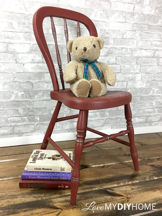


No, I'm not telling you to go hire a child model for your staging. But I am trying to make a point - don't just do what everyone else is doing. Get creative. Think outside the box. Find your own "Wow" factor for your staging. Furniture re-creation is an adventure and you need to communicate that to your prospective customers.
Create a little romance, surprise their senses, do the unexpected - get their attention! You've got three seconds to prove to the busy, looking for something special scroller that your photo is worthy of their time. Is it? Did you take the time to be sure that you would grab their attention?
“Simplicity is the ultimate sophistication.”
— Leonardo Da Vinci.